
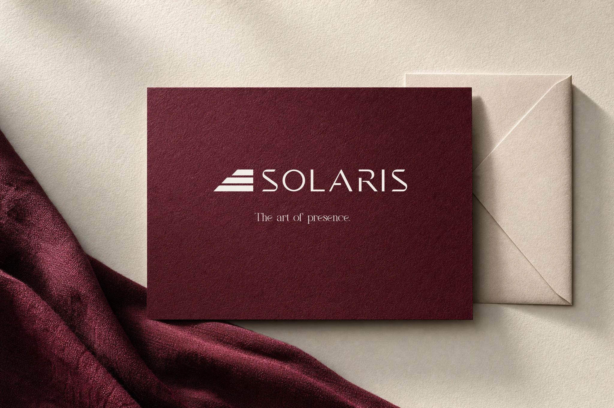
Bookcloth, ink, leather, evening light.
Brand AtlasColor palette
Color, almost tangible
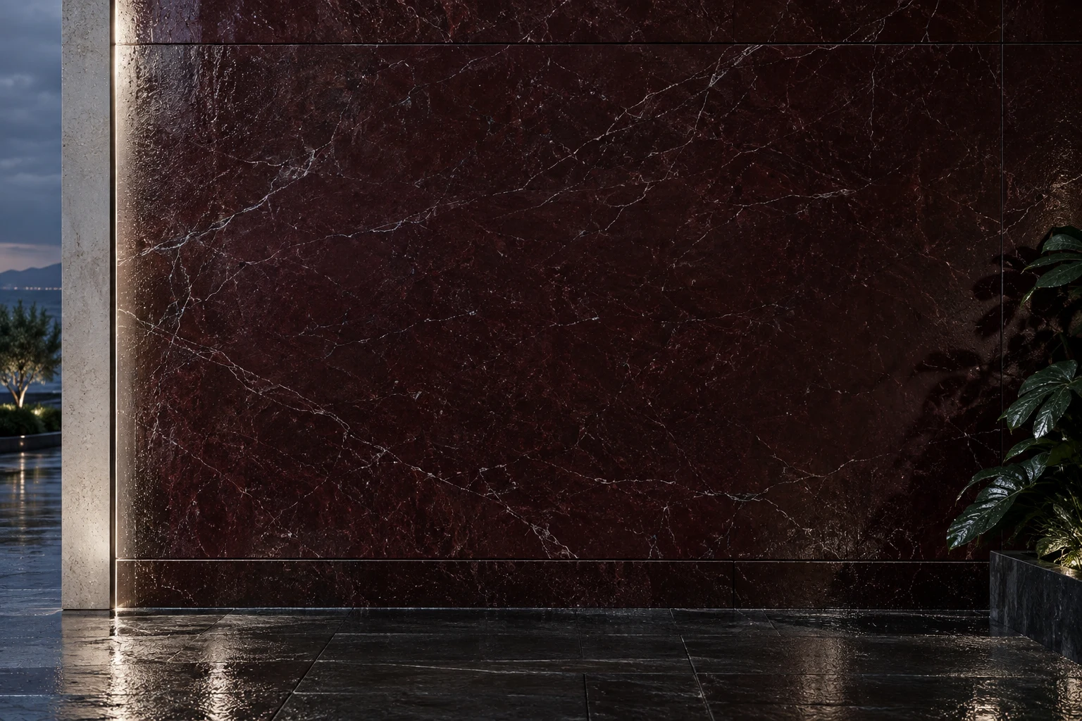
Burgundy gives depth. Pearl gives space. Ink gives the identity its quiet edge. Caspian Blue brings a supporting coastal note.
Select a color to copy its value.
Depth,
not volume
Burgundy is the atmosphere.
Pearl keeps the composition open.
Ink anchors the smallest details.
Forest, silver and Caspian Blue are supporting notes. Blue recalls the sky at dusk, paired with pearl and warm light.
Download source tokensExplore color palette in detail
THE SIGNATUREDepth,
Depth,
not volume
Editorial pages, correspondence, quiet surfaces.
Typography, framing, shadow.
Small objects and selected secondary details.
Digital neutral; satin-metal intent in physical work.
A supporting accent drawn from the blue-hour sky; pair with pearl and warm architectural light.
AN EDITORIAL STARTING POINT / NOT A QUOTA
Pearl 45% · Ink 30% · Burgundy 15% · Forest 7% · Silver 3%. Caspian Blue is an optional supporting accent, replacing another secondary note rather than increasing the total. Photography supplies most of the richness. A campaign image may invert these proportions.
Pearl on burgundy
Use for short campaign text and essential navigation.
14.34:1 contrast ratio